Project Details
- Client: Criminal Justice Network (CJN)
- Timeline: September 18, 2017 - October 12, 2017
- Team: Benton Dustman, Cody Gallup, and Laura Cesafsky
Tidbit Overview
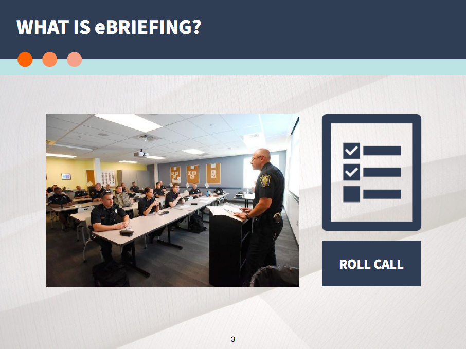
- We worked with CJN to redesign an existing web application called eBriefing.
- eBriefing is used by police officers to keep track of what's going on during their shift.
- We pinpointed the issues with the current system and redesigned the application.
Methods
- Stakeholder interviews
- User interviews
- Contextual inquiry
- Fly on the wall observation
- Heuristic analysis
- Journey mapping
- Affinity diagramming
- Wireframing
- Usability testing
Deliverables

The Problem
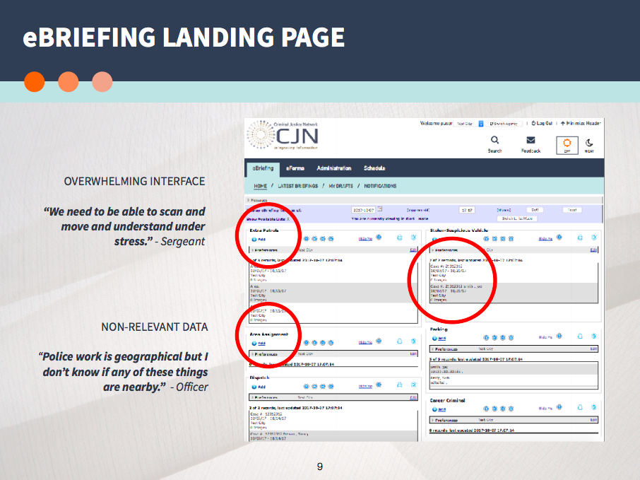
eBriefing is underutilized by police officers due to its overwhelming interface, abundance of non-relevant data, and severe communication limitations. Because of this, eBriefing is not a quick and easy way for officers to review, enter, and share pertinent case information. Therefore, police officers resort to other methods to accomplish these tasks.
The Solution
We redesigned the eBriefing application to better fit the daily needs of police officers. To accomplish this, we first enhanced scannability and simplified data entry. Next, we incorporated an interactive map to deliver personalized and geographically targeted data. Finally, we improved existing features to enable flexible communication.
The Process
Goals
- Conduct stakeholder meetings with the CJN team and create a SOW.
- Conduct user research by interviewing and shadowing police officers and sergeants.
- Audit and understand the current eBriefing application.
- Conduct user testing on the first prototype and reiterate as needed.
- Give a final client presentation.
- Prepare annotated wireframes, a final prototype, and other assets for client handoff.
Understanding the Client
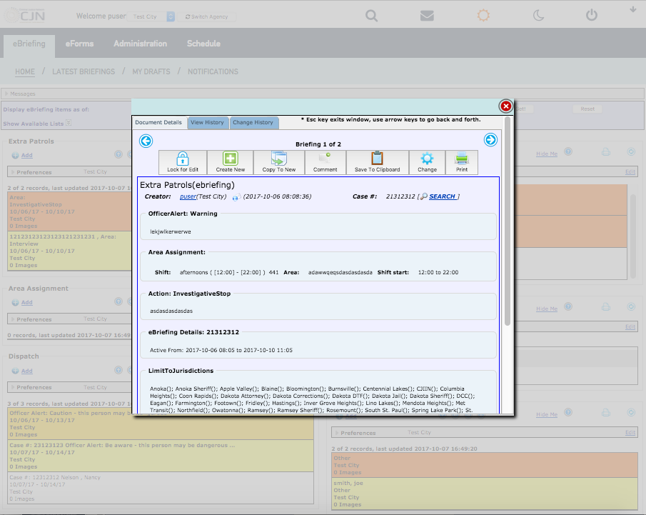
The Criminal Justice Network (CJN) creates web applications for Minnesota's criminal justice organizations (e.g. police departments, attorney offices, and prison systems). CJN's mission is to improve law enforcement's workflow by modernizing their process of viewing, recording, and sharing information.
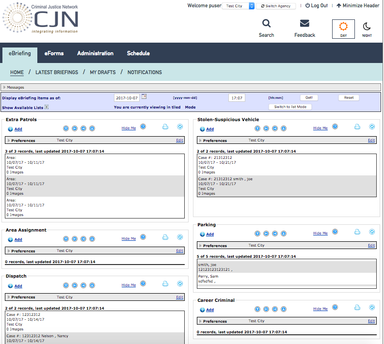
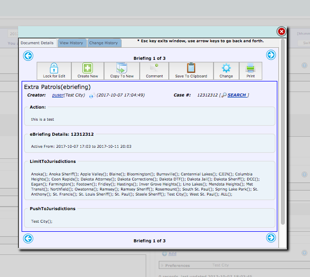
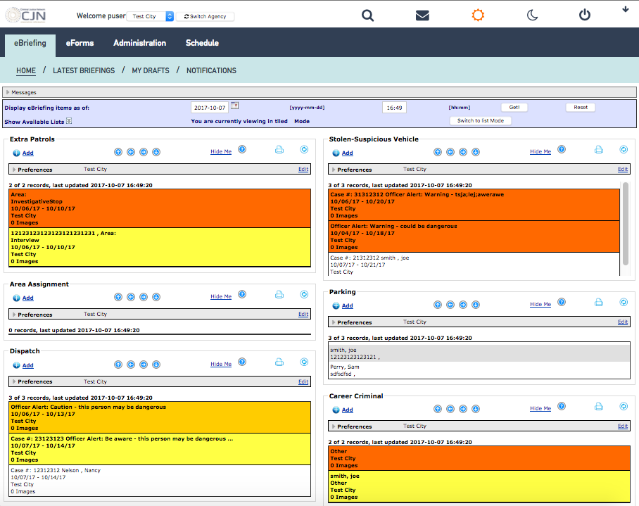
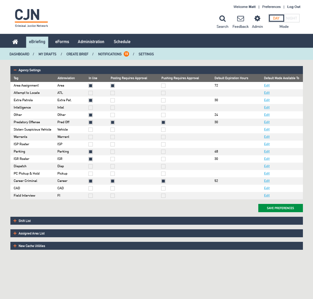
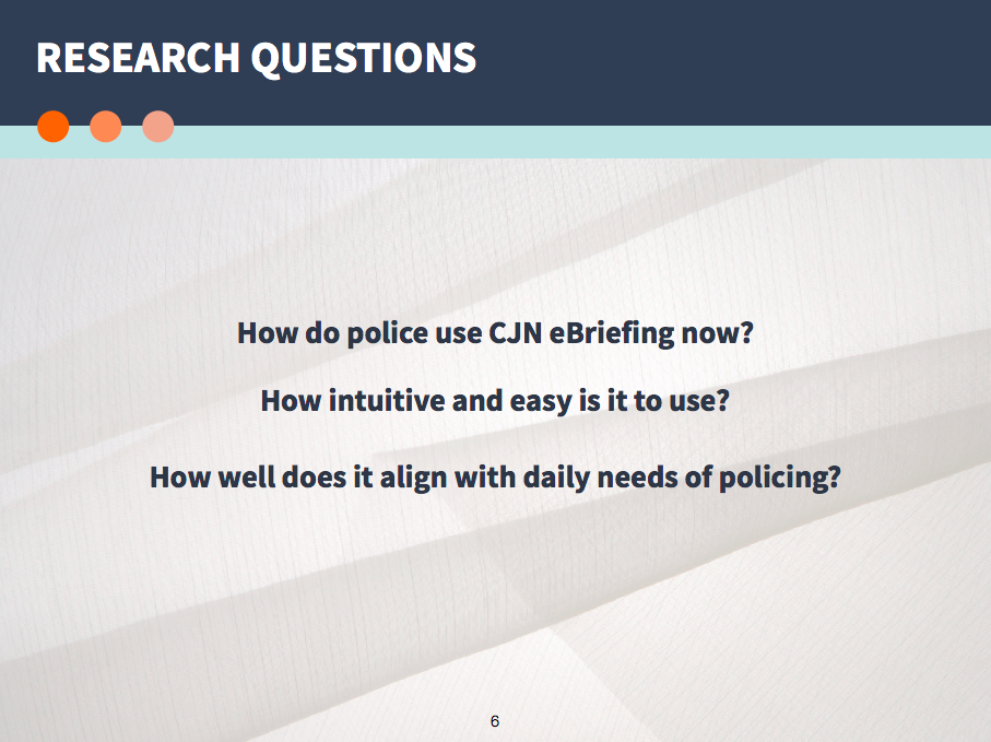
eBriefing is one of CJN's many web applications. Its primary function is to act as a platform where officers can document briefing information and share them with their colleagues and other agencies. This application is over ten years old, and CJN has been receiving feedback from officers that it is outdated and cumbersome to use. Our goal was to pinpoint why the current eBriefing application is difficult to use. The images below are screenshots of the current eBriefing system.
Getting Organized
To stay on track, we created a scrum board, set major deadlines, and setup an internal information sharing process. We agreed on a system to frequently communicate with our client so we could keep them in the loop without overwhelming them.
Research
Stakeholder Interview
We met with our clients Mary Cerkvenik and Tim Anderberg who were leading the eBriefing redesign. According to our clients, many officers no longer used eBriefing because it's too difficult to use. Our job was to figure out why. As we found out more about the application, it appeared that we would focus on two different user groups:
- Police officers (standard user status)
- Sergeants/admin(supervisor and administrative user status)
User Interview and Contextual Inquiry
To get first hand experience of the users, we conducted two user interview/contextual inquiry sessions. For the first session, we spoke to one officer from Bloomington PD. [1] For the second session, we spoke to a group of five officers from Hastings PD, Dakota County Sheriff Department, and St. Paul PD. [2]
The following were the high-level take aways:
- Many officers only use eBriefing when their department makes it a required part of their process flow.
- eBriefing is used as a proactive to-do list. Officers usually open up the application when they don't have other calls coming in.
- Officers are intimidated and wary of learning another complex system since they already deal with many others applications.
- Officers don't have time to go through all the fields when creating a briefing item.
- Officers' job is extremely fast-paced. They need to be able to glance at the most pertinent information, then act.
- There is no effective way to communicate to other specific officers within the eBriefing application.
- Officers' jobs are very location and time based.
“We need to be able to scan and move.”
“We don’t have much time and we have other priorities. If we look at the page [eBriefing] and it looks complex and overwhelming, we have less motivation to use it.”
“Our job is very geographical in nature, so being able to visualize relevant location information would be really helpful. ”


Heuristic Analysis
To narrow down the specific design problems, we individually evaluated the application using heuristic principles. As a group, we compiled a document listing all the detailed problems with each feature within eBriefing. [3]
Synthesis
Brainstorming the Problem Space
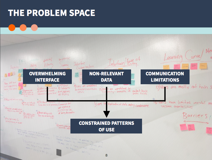
We collaborated and brainstormed as a group to start understanding the problem space. To wrap our minds around all the information we had gathered, we started grouping together some of our findings from our client meetings, user interviews, contextual inquiry sessions, and heuristic analysis. One might say we created a really messy affinity diagram. Some issues and patterns regarding certain features of the eBriefing application started to emerge.
The Wall Of Problems
Once we made our first affinity diagram, we quickly realized that we still had a lot of data that needed to be accounted for. We created an affinity diagram version #2 so we could really distill down all of the information we had. The goal of this was to nail down specific problem statements that would set the stage for our problem space. From the various groupings/themes of post-its that emerged, we created concise problem statements for each problematic application feature and usability issue. [4]
Journey Maps | Current State (Prepared by Laura Cesafsky)
To get a better idea on how eBriefing was used, our teammate Laura created detailed journey maps showing the current journey of our two user groups: the police officer (standard user), and the sergeant (supervisor/admin user). This helped us visualize where pain points existed throughout the user's journey. [5]
So... what's the problem?
1. Interface is complex and overwhelming.
2. Abundance of non-relevant data.
3. Severe communication limitations.
Strategy
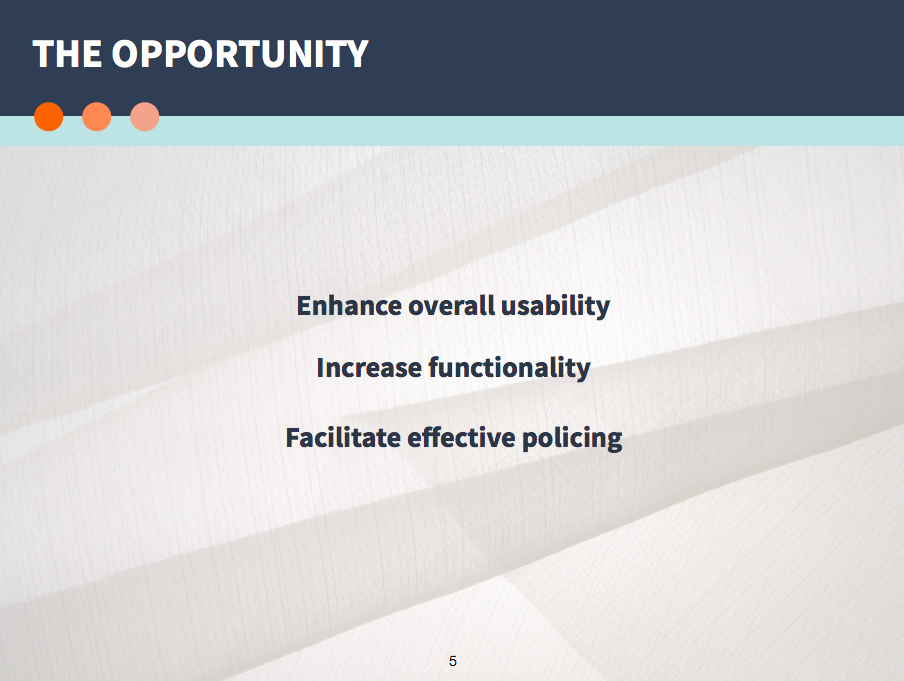
To address the problem presented above, we developed a three-part strategy. To create an application that will be more intuitive and better aligned with police officer's daily needs, we focused on creating solutions in the following way:
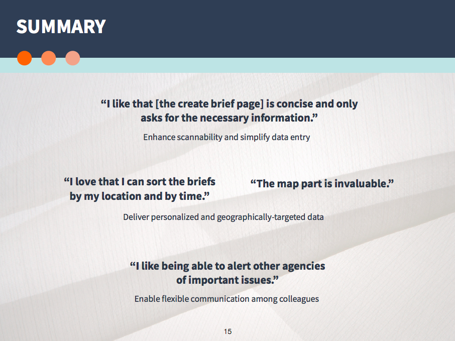
1. Enhance scannability and simplify data entry.
- To do this:
- Decrease the signal to noise ratio of the landing page.
- Pare down and redesign the data entry feature.
2. Deliver personalized and geographically-targeted data.
- To do this:
- Implement new tagging and filtering system for categorizing different types of briefs and improving visibility of relevant information.
- Incorporate an interactive map at the top of the landing page.
3. Enable flexible communication among colleagues.
- To do this:
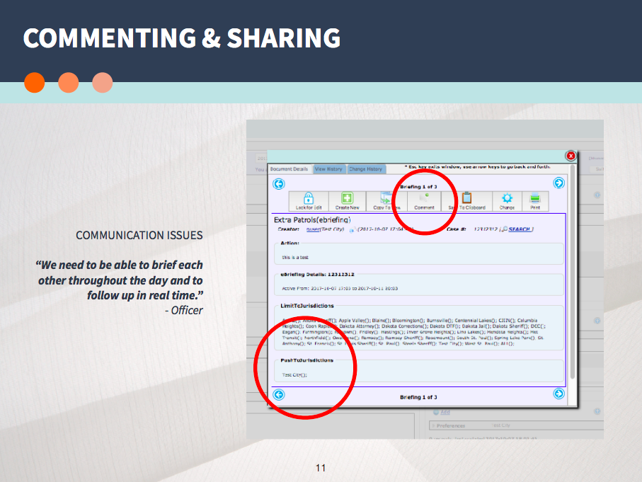
- Create a more intuitive and visible brief commenting system.
- Increase visibility of notifications.
- Clarify the verbiage and overall process for alerting other agencies of specific briefing items.
Design
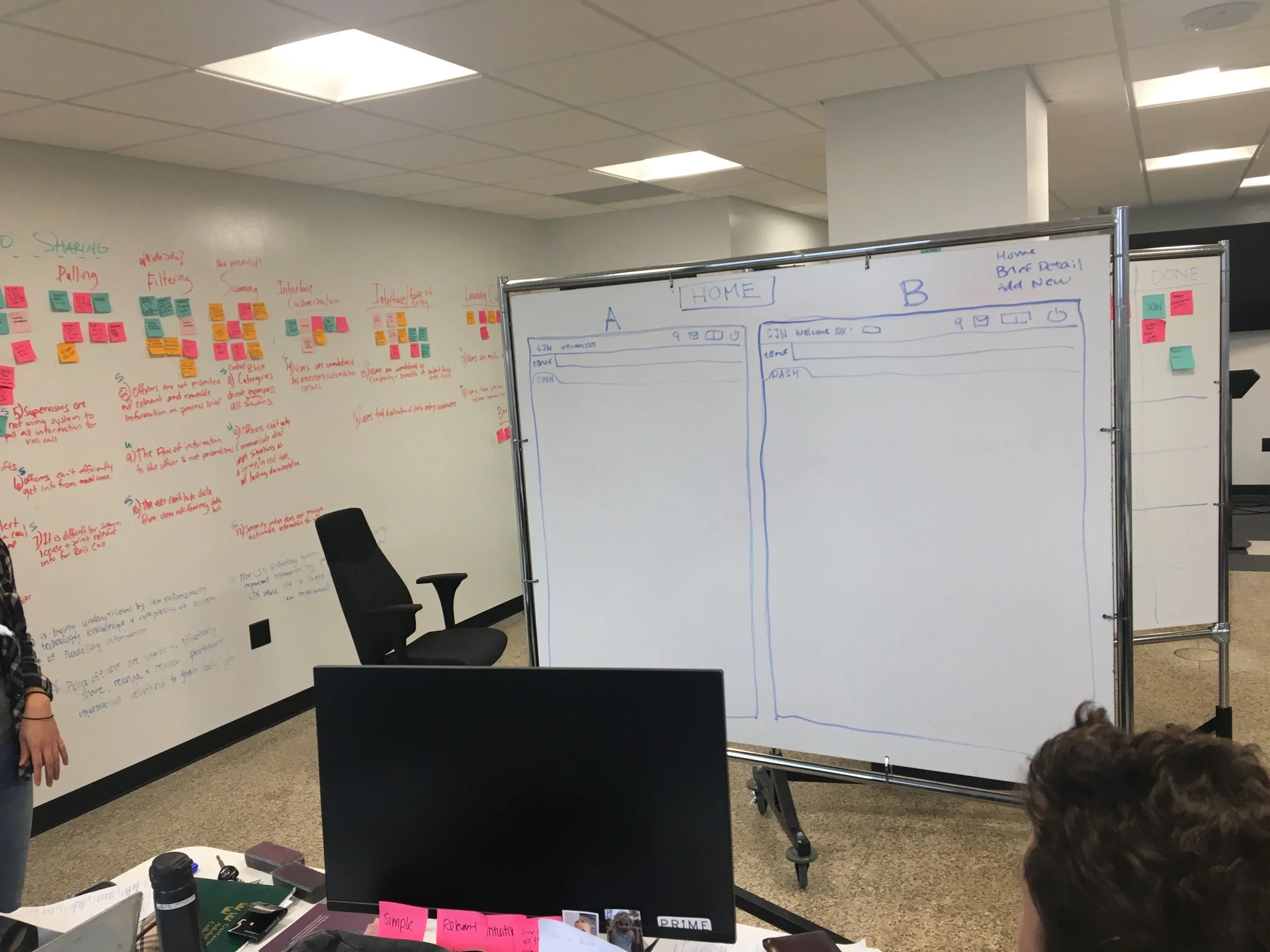
Low Fidelity Wireframing
The following are some of my low fidelity sketches, wireframes, and user flow that I created in the early stages of design.


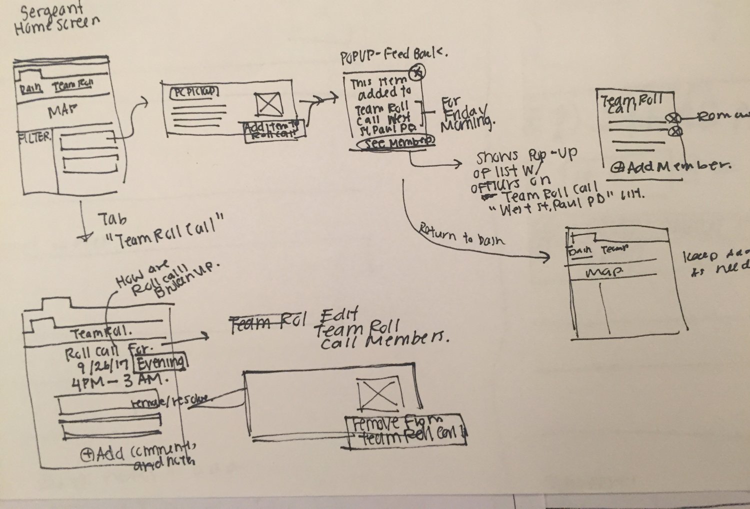

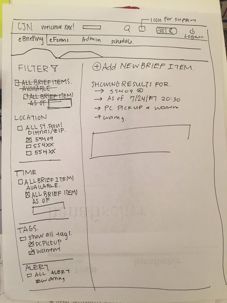


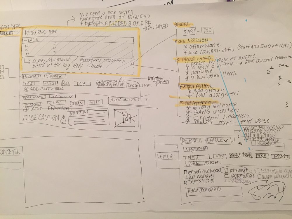
From here, we came together as a group to share our ideas and make decisions on what we wanted our final designs to look like. For many of the screens, we drew our design on the whiteboard, and then discussed and iterated on the spot.


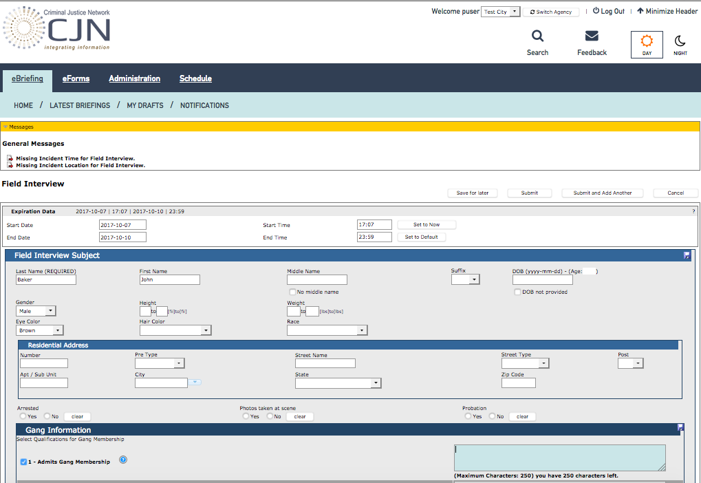
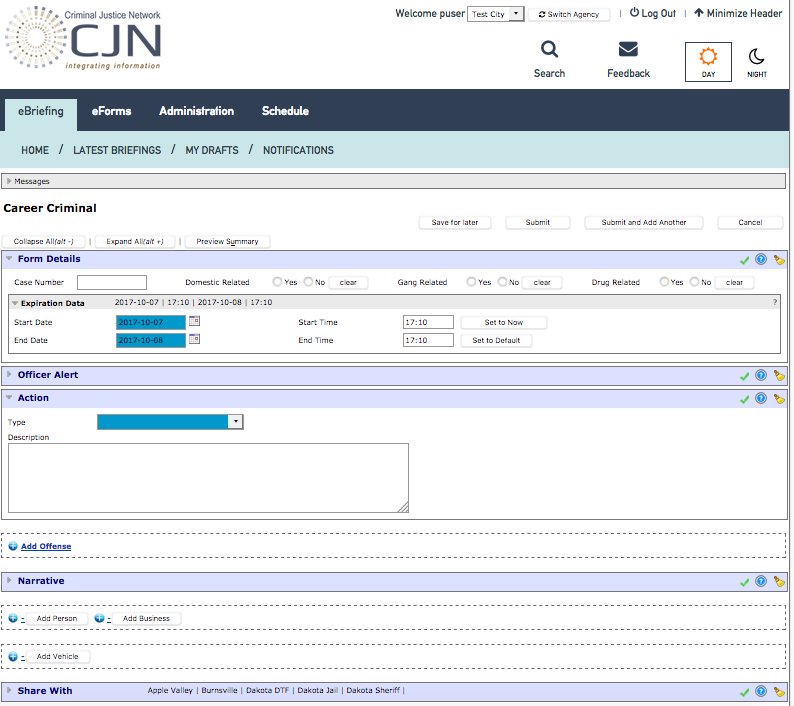
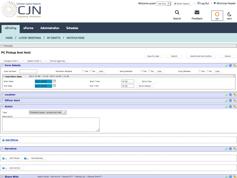
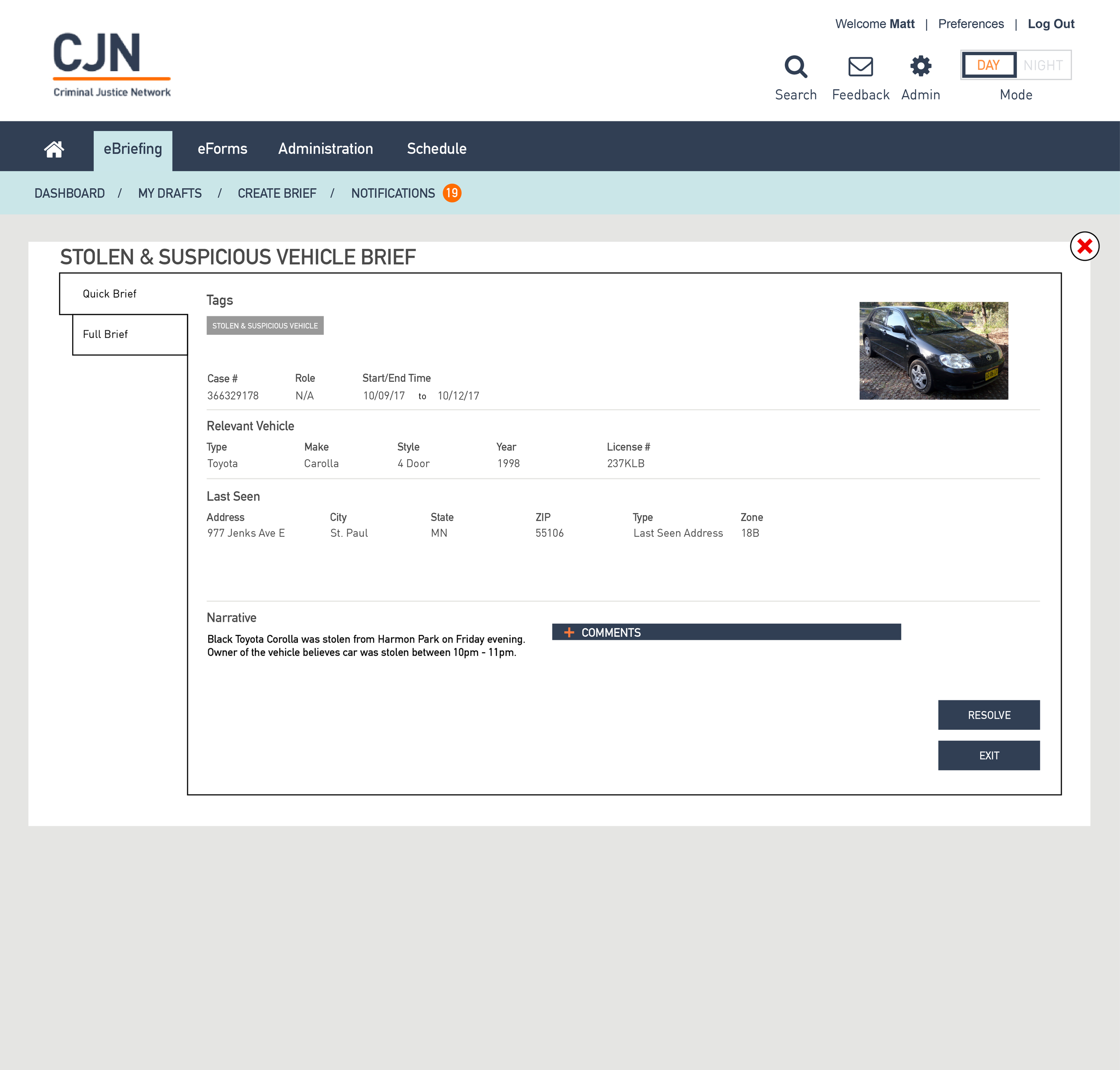
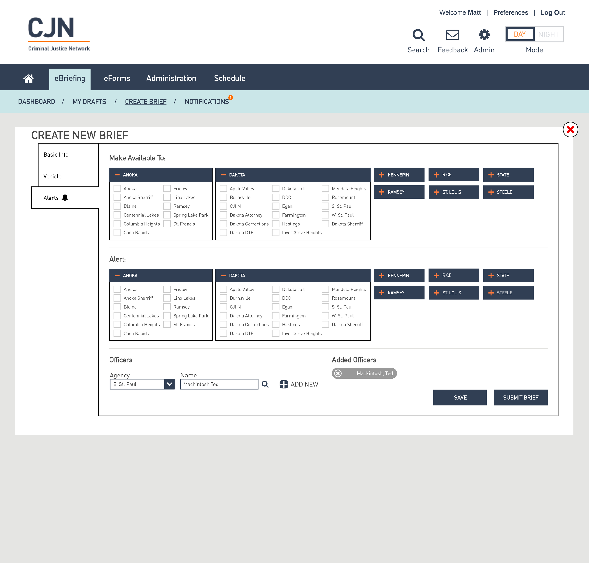
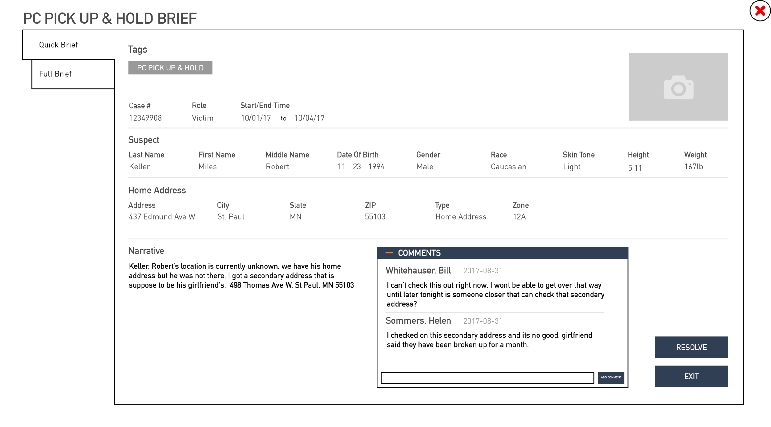
High Fidelity Wireframing (Prepared by Benton Dustman and Cody Gallup)
Our teammate Benton took the lead, and with the help of Cody, they created many of the high fidelity screens that are shown here.


Iterations
The post-it critique method was a great way to discuss and make design decisions as a group. It helped make sure everyone's voice was heard, we saw each other's ideas, and we didn't miss anything crucial during the process.
We also touched base with Tim, the development lead at CJN during the middle of our design process to ensure that we were on track. It also helped us verify that our designs were realistic from a developer's point of view.
Prototype (Prepared by Cody Gallup and Laura Cesafsky)
Our teammate Cody took the lead in creating an interactive prototype. With the help of Laura, they came up with a prototype that could be used during our usability test. [6]
USABILITY TESTING AND REDESIGN
We had the opportunity to have three police officers come in for usability testing. This lasted approximately 30 minutes per officer. [7] Overall, the response to the prototype was positive. The following are the high level takeaways:
1. The filtering, tagging, and overall layout of the landing page was shown to be intuitive. However, there was concern that the preview brief took up too much space and it could lead to a lot of scrolling. In future iterations, we would like to consider how this could be designed to take up less space.
2. The interactive map was a big hit. It confirmed how important geographical information was to officer's daily needs. The next step is to determine how the map should stick to the page once scrolling starts. It would be interesting to do more research on how this interactive map feature could be optimized.
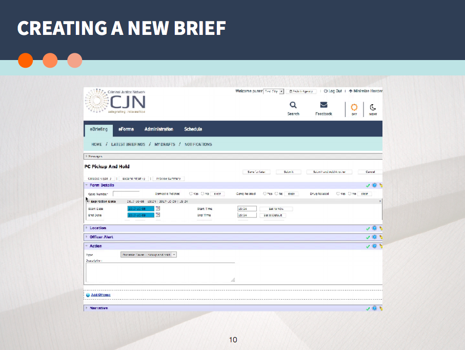
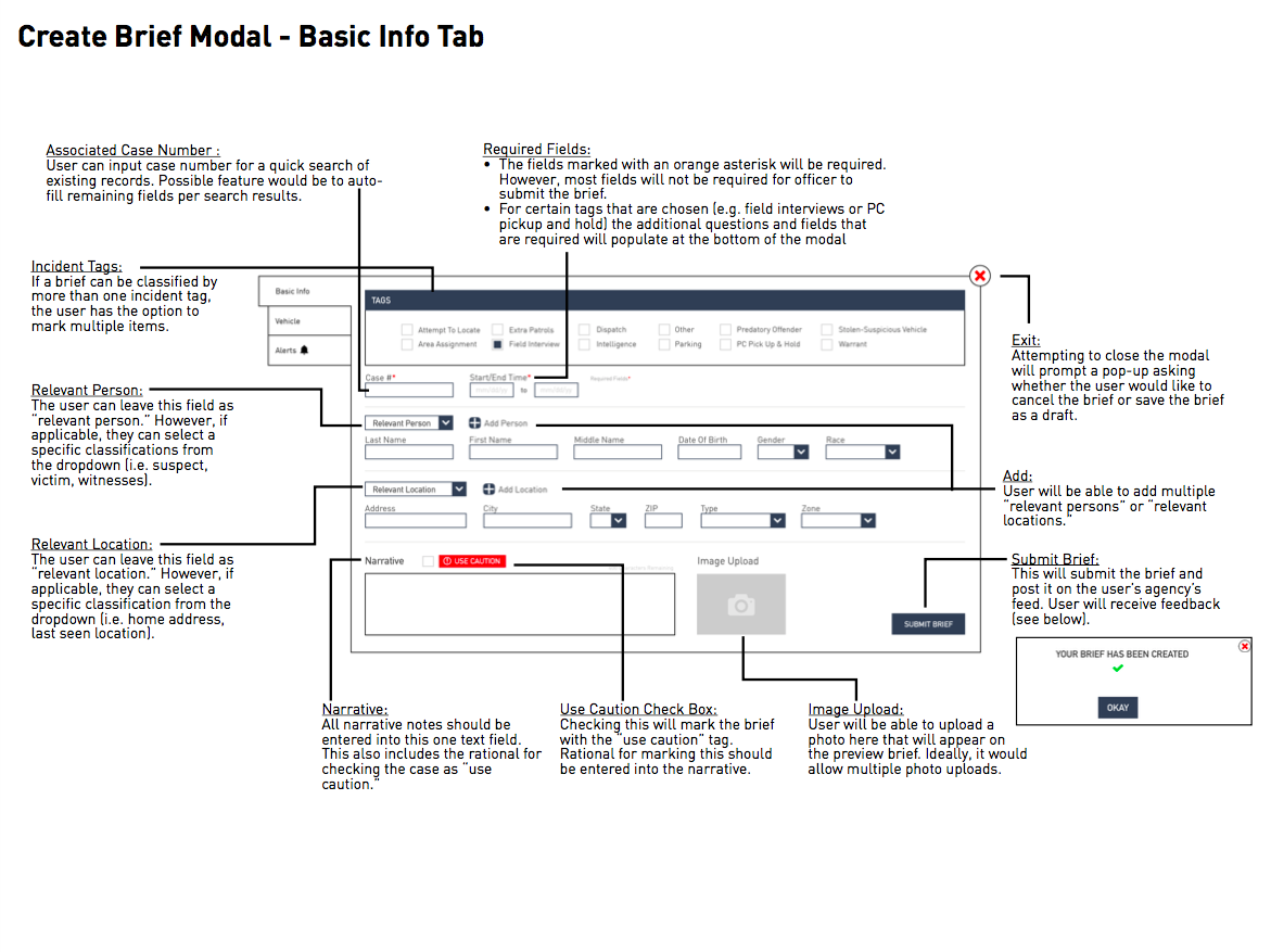
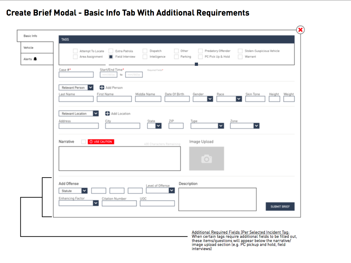
3. Overall, the simplified "create brief" process was positively received. However, there was concern with having limited options when setting a brief's address field. For example, a certain incident may have multiple addresses (e.g. location of the crime and the home address of the suspect). To remedy this for the final design, we created an option to add multiple locations and select a location type from a drop down.
4. A final concern was that the "use caution" signifier was not visible enough and was a source of concern. To remedy this for the final design, we changed the color and increased the visibility.
Client Presentation
The final capstone to our project was putting together a formal presentation to pitch our design to our client. We worked as a group to pare down three weeks of research and design into a concise yet informative presentation. [8]


Annotated Wireframes
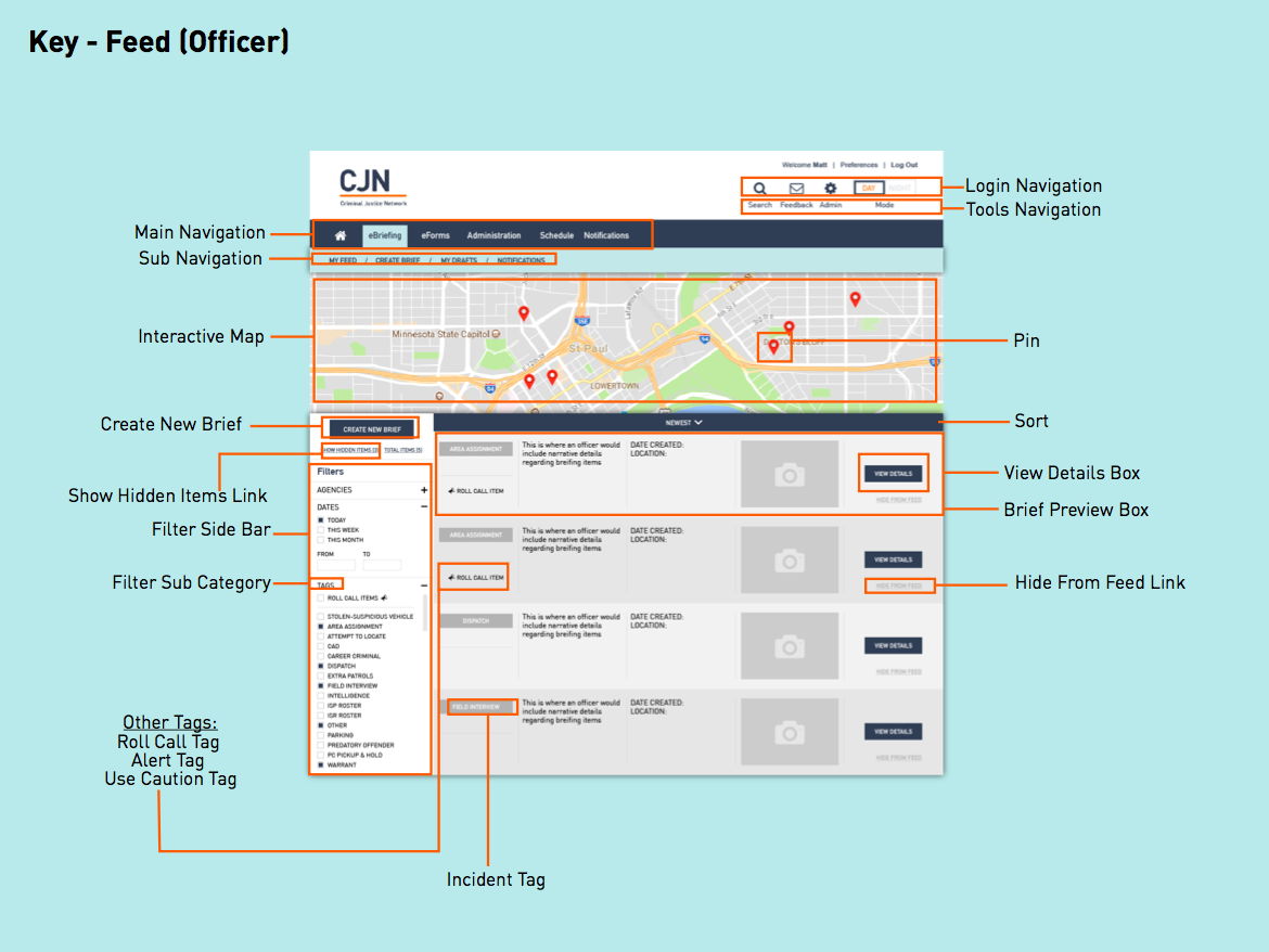
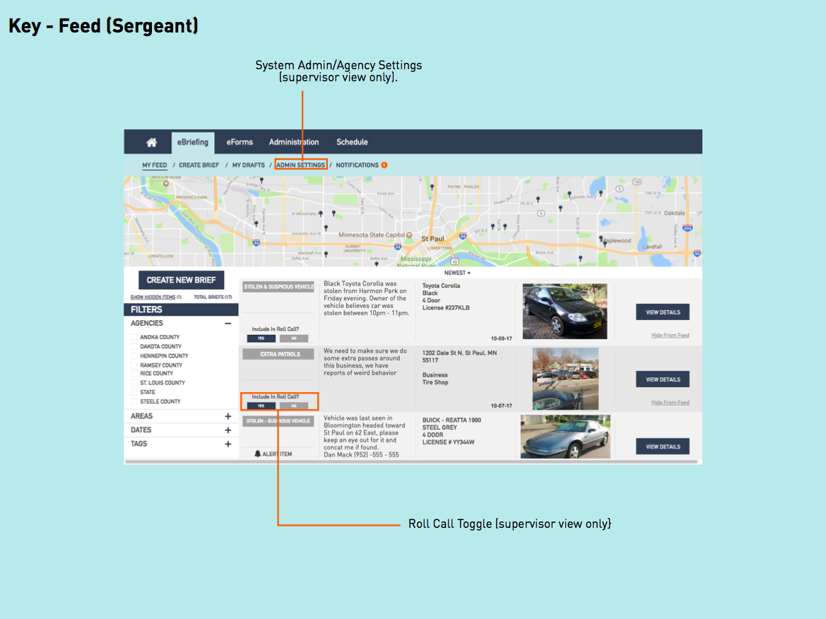
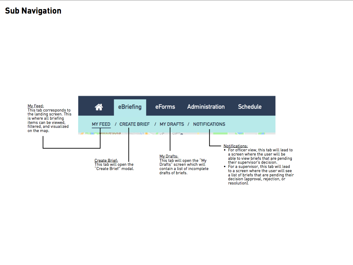
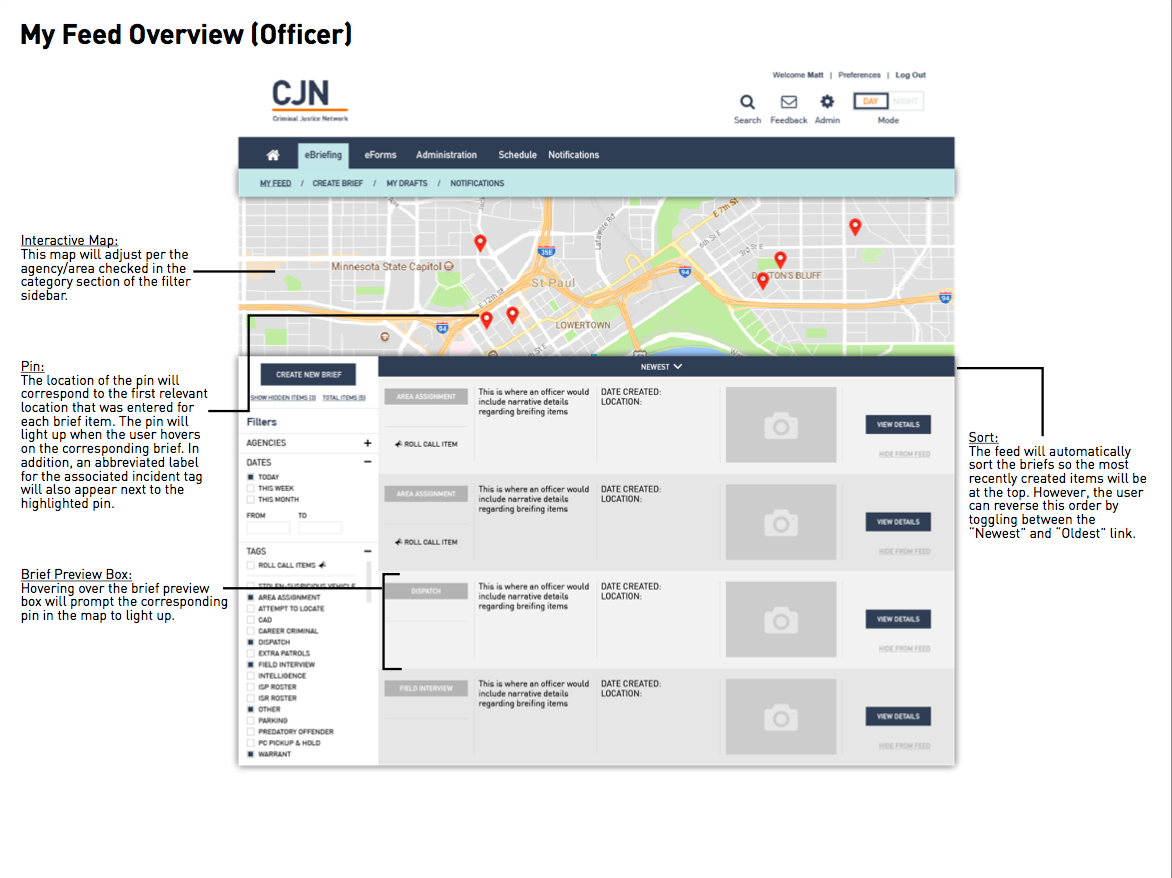
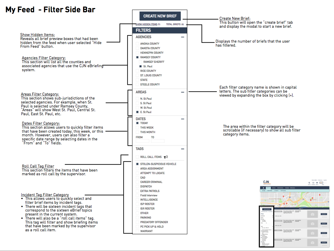
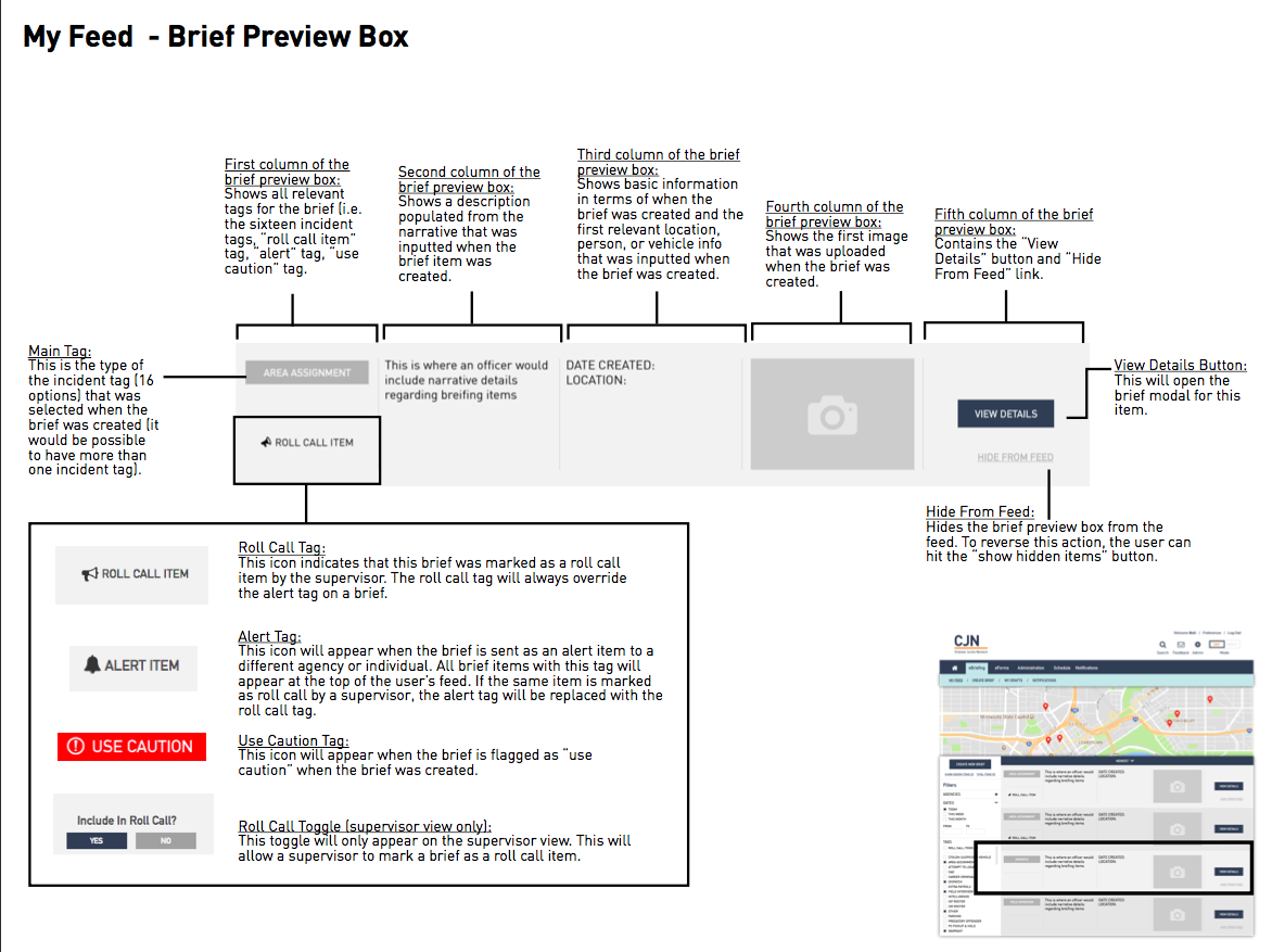
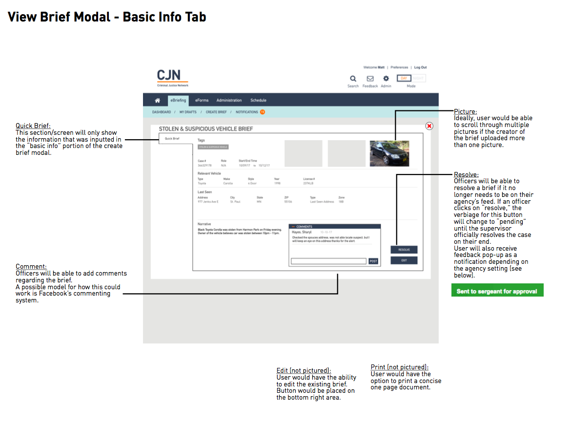
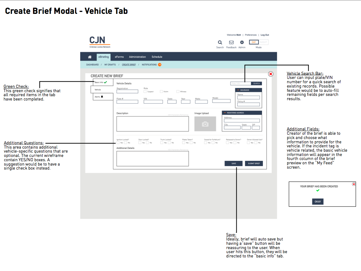
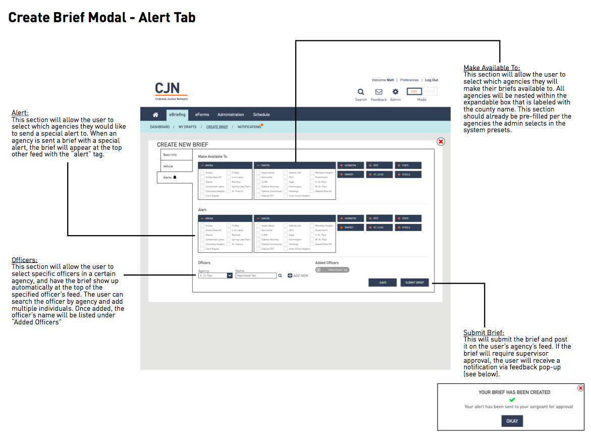
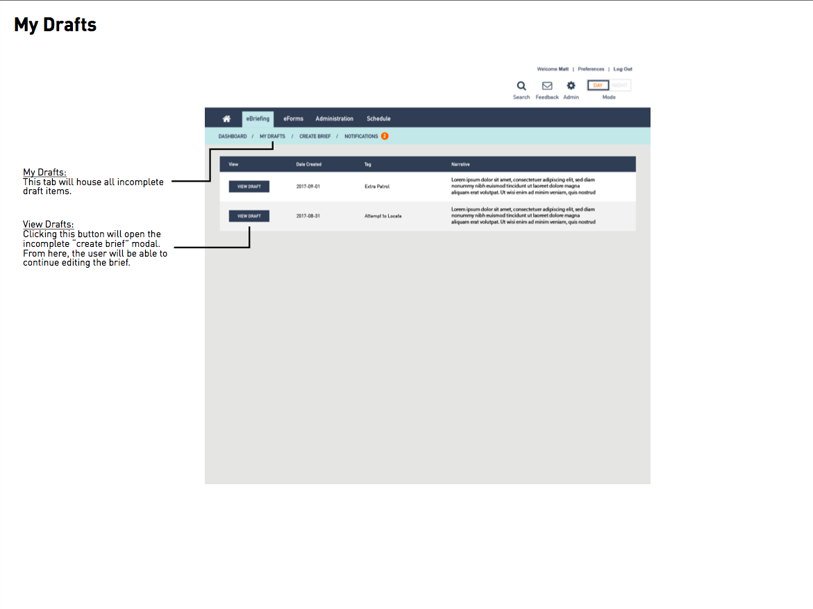
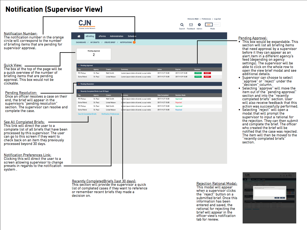
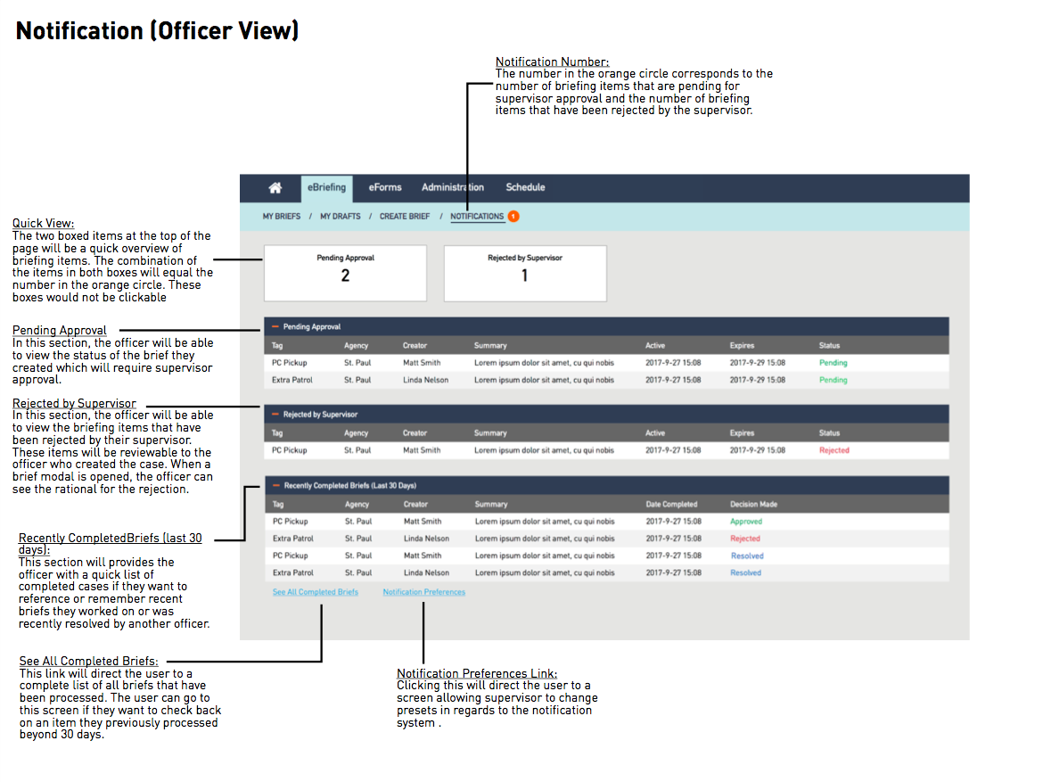
Part of the SOW was to provide the client with a set of annotated wireframes to help with future eBriefing. I took the lead in the final annotations. My teammates reviewed and provided feedback on the deck, and we made final edits as needed. [9]
Next Steps
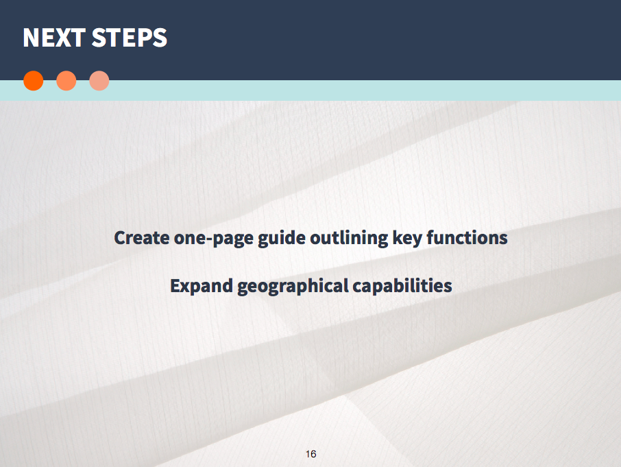
1. The next step for this project would be to conduct usability tests and feedback sessions on a larger scale. Since the process of incorporating eBriefing into the workflow varies by department, it would be important to get feedback from as many officers from different departments as possible.
2. Although the goal of redesigning this website is to make it more intuitive, our group acknowledged the fact that there needed be some form of documentation to improve the first-time user's experience. We agreed that the most effective way to improve the learning curve of eBriefing would be to create an easy, one-page cheat sheet showcasing the key features and abilities of eBriefing.
3. The map component of the newly redesigned eBriefing system was determined to be very valuable. Because of this, it would be important to look into further enhancing the interactive map, and determine what is missing from the current map that will further aid officers when they are on their shift.
Conclusion
This group project was a great learning opportunity. Not only were we challenged to take on this project on our own as a group, we were given the flexibility to truly be our own project manager. The chance to work with our client CJN, eBriefing users, and rapidly collaborating and designing as a group was an invaluable experience.
Documentation & Deliverables
[1] ^ officer interview and contextual inquiry - round one [open pdf]
[2] ^ officer interview and contextual inquiry - round two [open pdf]
[3] ^ heuristic analysis [open pdf]
[4] ^ problem statements [open pdf]
[5] ^ journey maps prepared by Laura Cesafsky [open pdf]
[6] ^ prototype prepared by Cody Gallup and Laura Cesafsky [open axure link]
[7] ^ usability test script [open pdf]
[8] ^ client presentation [open pdf]
[9] ^ annotated wireframes [open pdf]